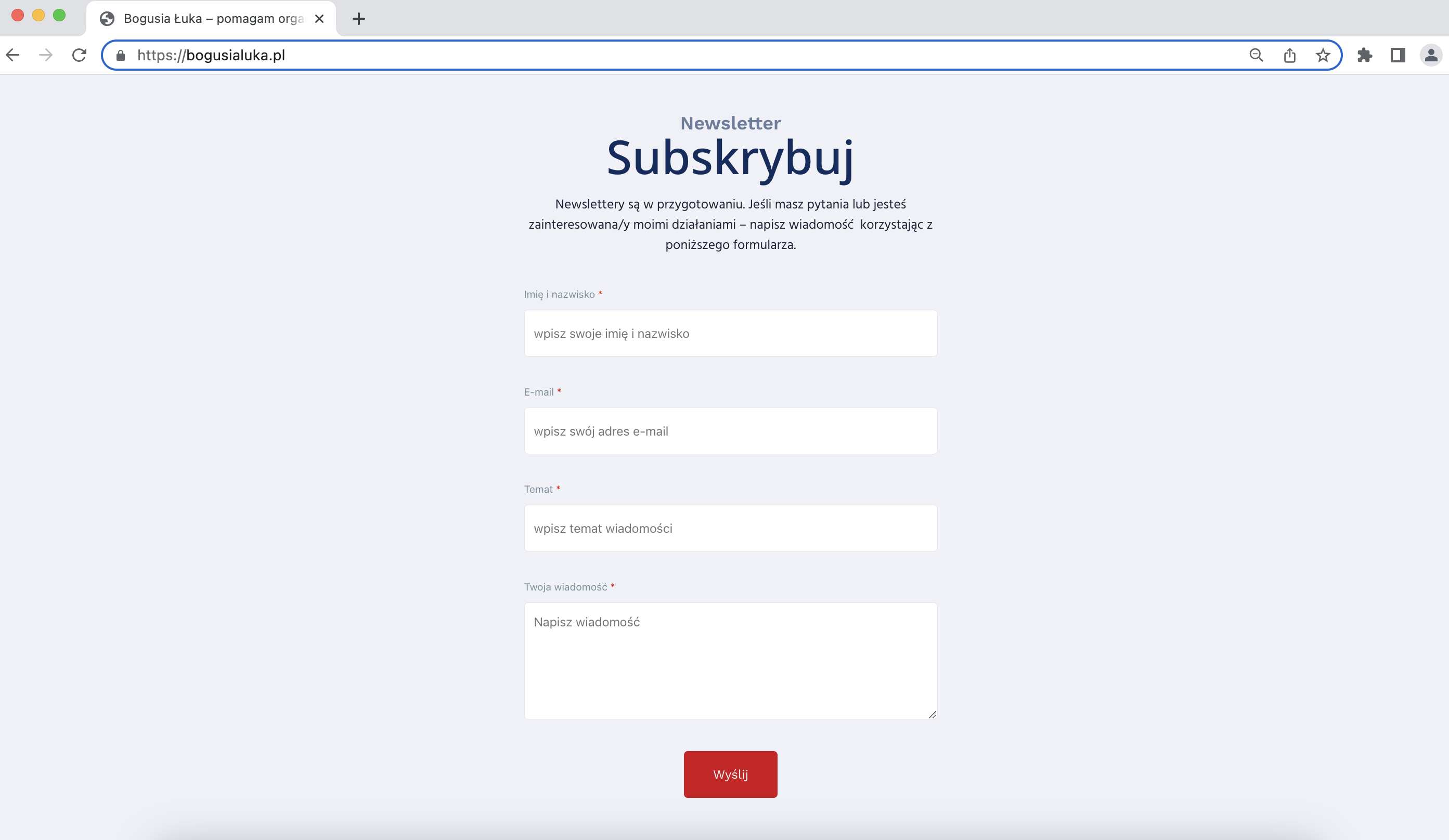
Website design: case study

Overview / Developing a user-friendly website in the form of a business card that will encourage business leaders to take advantage of the offer and choose the right products for them.

Role / Website design, content architecture, coding, uploading to WordPress, domain linking.

Duration / 2 months (02-03.2021)

Problem statement / Organisational and educational leaders often face challenges in effectively linking development vision, management, planning, fundraising and goal measurement. The lack of coherent and user-friendly knowledge results in inefficiencies, missed opportunities and suboptimal decision-making.

Goals / Finding advice and assistance to build an appropriate strategy and development plan for the organisation.

bogusialuka.pl

BogusiaLuka.pl

Let's see the design process 🙂

About project / The main idea of the website is to present the person and the scope and form of the business and to encourage cooperation with potential clients.

Guidelines - brief / Simple, one-page form. Design of a business card page, presenting a brief description of the person, scope of activity, business offer and contact.

Structure / Highlighted six sections with images and descriptions to be included on the page e.g. about me, what I do, areas of cooperation, how I work, principles, contact form. Most of the content and images were provided by the client.

BogusiaLuka - Home Figma

Colours / Started with a mood board to choose the colours of the site. Decided to use cold colour palette, a combination of navy blue and red, which referred to an earlier photo shoot from which the photos were used in the final version of the website. The colours are intended to refer to classic business elegance.

Fonts / Simple, reader-friendly, sans-serif fonts in similar tones.

<h1> Main headings are written in NOTO SANS font, weight: 500;

<h2> smaller headings in WORK SANS font, weight: 600;

<p> and longer texts in HIND font.

Featured image / The page kicks off with an opening slogan on a background image with an additional transparent overlay to make the content more visible.

Menu - navigation bar / At the top of the page there is a responsive anchor menu - clicking on a menu item/button redirects you to the correct place on the page via a link.

Visual effects / It's good to know about a few elements that have been added to make the website more attractive when using it.
  • image sliders - to add some movement in the display of the image photos,
  • dedicated icons - to make the principles of cooperation more memorable,
  • input animation - for individual sections and elements as the page is scrolled.
  • Contact form / A section has been added for a contact form, which can be used to easily send an enquiry or request for contact. The site owner receives the message straight to his or her inbox.

    Responsive website / The website is fully responsive, scrolls well on mobile devices, tablets, laptops and desktops with larger monitors.

    More projects in which I have been involved in the website design process​

    Jakub Zommer

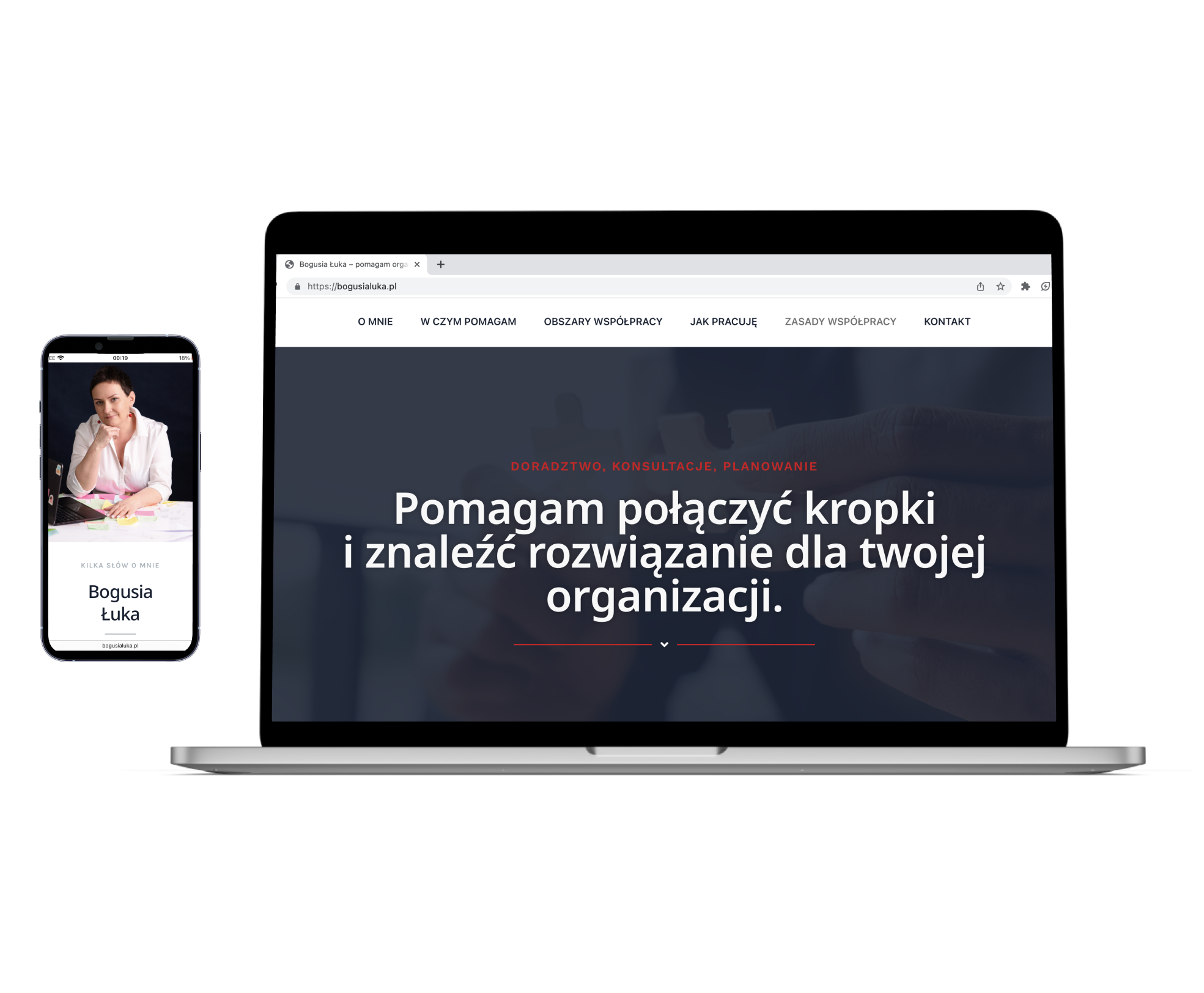
    My projects at one page. In progress - still improving and updating the portfolio page. I have built this page using a WordPress module.

    Green Dealers

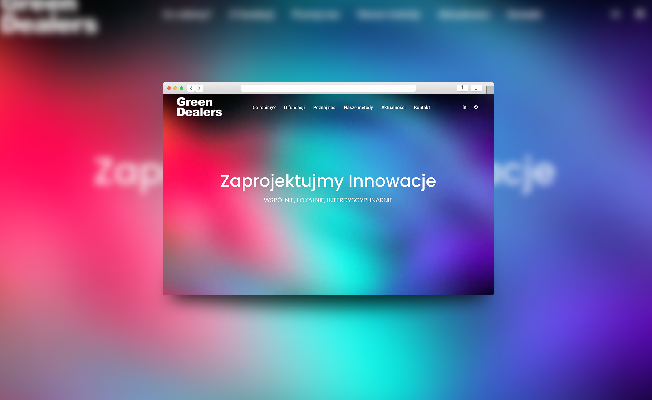
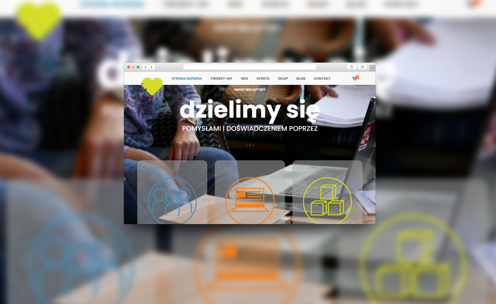
    Foundation, which helps build the green solutions of the future. I helped set up and design the website.

    Dobra Relacja W Grupie

    Group work training, original role play card game. I helped set up and design and run the site. The website is currently being redesigned.